Overview of campaign modules
Modules are the building blocks of your email campaigns. They contain placeholders where you can add the text, images, buttons, styles, and layouts that make up your campaigns.
You can add as many modules as you like, change the type (different layouts of text and images), and rearrange them to suit your design needs.
Module buttons are located at the bottom of a campaign that's open in Edit mode. 
| Module button types and descriptions | ||
|---|---|---|
| Icon | Module type | Description |
 | Image & Text | Mixed module with an image placeholder on the left, and a text placeholder on the right. |
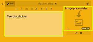
 | Text & Image | A mixed module with an text placeholder on the left, and image placeholder on the right. |
 | Text | A full-width text placeholder.You can format text within the text block, and change the text styling in the style editor. |
 | Image | A full width image placeholder. You can add more images in a row, and it can be resized. |
 | Section Title | A special text block that contains only top-line H1 styled text. You can change the styling of the section title text independent of the other text types in the style editor. |
 | Button | A call-to-action button that allows you to define the display text and link to any URL. You can change the button styling in the style editor. Learn more about the button module. |
 | Divider | A horizontal line to visually separate different chunks of your campaign. |
The following is an example of how the Text & Image module appears in a campaign with the Fuzzy Fire style applied.
